Your cart is empty
Tax included and shipping calculated at checkout

Drawer menu
Tax included and shipping calculated at checkout
A professional account gives you stylist pricing, priority support, early access to new releases, and education developed by working stylists.
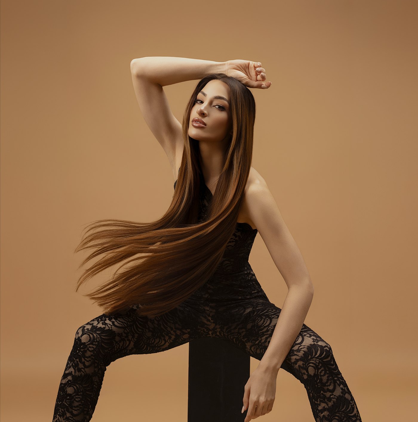

A client sits in the chair with a grown-out balayage, a darker root, a bright face frame, and faded ends that don't match any single swatch on the wall. The install is booked. The expectation is undetectable. If the shade choice is off, even a clean row and perfect tension won't save the result.
That's where most extensions color chart content falls short. A chart can name shades, but it can't make the matching decision. That decision still comes from the stylist reading level, undertone, placement, density, and visible dimension at the same time.
Licensed stylists already know this isn't about holding one sample at the root and calling it done. Important work happens in the consultation, in natural light, with the right sections separated out, and with the discipline to match what the client shows through the mids and ends.
A clean color match looks effortless only after the work is done. Before that, it's a technical judgment call with money, time, and reputation attached to it. The client sees “blonde” or “brunette.” The stylist has to see the base shift, the warmth through the ribboning, the faded porous ends, and the exact point where extension hair will start to live against natural hair.
That pressure isn't new to the craft. Hair extensions trace back to Ancient Egypt around 3400 BC, where wigs and sewn-on extensions were made from human hair and dyed sheep's wool, and bold shades such as gold and blue were already part of the look, showing that color differentiation sat at the center of extension work from the beginning (documented history of hair extensions).
That history matters because it reframes the extensions color chart. It isn't a modern add-on. It's part of the identity of extension artistry itself.
Practical rule: If the color plan is weak, the install will read like an add-on no matter how strong the method work is.
Behind the chair, the difference between a basic match and a premium result is rarely the single swatch. It's the stylist's ability to decide whether the client needs a solid tone, a rooted transition, a highlighted pattern, or a blend built to disappear through movement.
That's the standard. Not close enough under overhead lighting. Not acceptable from the front only. Perfectly blended from the side, through the crown, and when the hair lifts off the shoulder.
A professional extensions color chart should work like a map, not a paint deck. It has to tell the stylist where the depth sits, what the undertone is doing, and whether the shade was built for a flat match or a dimensional one.

Modern extension color systems are structured because exact matching has become standard practice. One published chart organizes shades on a 1 to 12 level system and uses hue codes such as Ash, Natural, Red, Gold, and Bleach, showing how professional selection goes far beyond light versus dark (structured extension color chart systems).
That same source notes that one major supplier carries 43 Natural colors created through hand-blending, which tells stylists something important. A serious chart can't stop at brunette, blonde, and red. It has to account for soft shifts, mixed reflects, and in-between shades that show up constantly in real consultations.
For a broader look at curated shade families and salon-facing matching logic, stylists can also review Conde's guide to hair extension colors.
The quickest way to use an extensions color chart well is to stop treating every family the same.
| Shade family | Primary job in the chair | Best use case |
|---|---|---|
| Solid | Creates consistent depth from top to bottom | Single-process brunettes, cleaner blunt finishes, filling density without visible variation |
| Balayage | Mimics painted lift and soft transitions | Clients with lighter mids and ends, broken-up brightness, softer lived-in color |
| Bronde | Bridges brunette and blonde without reading stripey | Neutral mixed tones, low-contrast luxury blends, soft seasonal transitions |
| Highlights | Repeats visible ribboning | Face frame continuity, top-layer brightness, installs that need clear pieces of lightness |
| Superblend | Diffuses multiple tones into one install | Heavy highlighting, scattered brightness, softening lines of demarcation |
| Rooted | Carries depth at the top with brightness below | Low-maintenance grow-out, shadow-rooted blondes, dimensional installs near the part |
| Fantasy | Places intentional non-natural tone | Editorial work, accents, fashion placement, custom impact pieces |
A chart like this should change product selection too. Volume Weft and Thin Weft installs usually need the row to read as one cohesive field, so family choice affects diffusion. Tape Weft and Tape-In work often expose more panel behavior, so undertone consistency matters fast. K-Tip and Bulk give the most freedom for micro-blending, while Clip-In matching has to survive movement without the forgiveness of permanent placement.
A smart stylist doesn't just ask, “What shade is she?” The better question is, “What pattern of color is visible once the install goes in?”
A shade match fails in two ways. The depth is wrong, or the temperature is wrong. Sometimes both are wrong, and the install still looks almost right in the salon chair until the client walks outside.

Level is the vertical read of the swatch. Dark to light. That sounds basic, but extension work punishes even slight mistakes in depth because added hair increases visual weight. A level mismatch that might pass in a traditional gloss service becomes obvious once fullness is added through hand-tied rows, microlinks, or bonds.
This is why dirty blonde work gets mishandled so often. The mids can sit in one place, the ends in another, and the client still describes all of it as blonde. A useful reference for that category is this dirty blonde extension matching breakdown, because it highlights how “dirty blonde” usually contains more than one read.
Undertone is what makes the match believable. Two level-7 shades can sit side by side and still fight each other if one throws gold and the other reads neutral ash. On cuticle-intact human hair, especially with smoother reflection, those differences show up immediately around the face and top layer.
A fast salon check helps:
The swatch that matches in stillness but flashes wrong in movement isn't a match.
Stylists also have to account for the fact that extension hair reflects differently depending on method and placement. A compact panel of Tape-In hair can read denser and more solid than the same shade installed as K-Tips. A Thin Weft can soften a transition that a thicker row might sharpen. That's why level and undertone should never be chosen separately from method.
A client sits down convinced she needs to match her root. You can already see the problem. Her root is fresh, her mids are warmer, and her ends are lighter from old lightening and daily wear. If you match the top, the install reads heavy and obvious by the time it hits the shoulder line.

Good matching starts before a single swatch touches the hair. Service history changes the read. Old glosses, toner grab, mineral staining, sun fade, and dry ends can all push the eye in the wrong direction. A structured hair extensions consultation process prevents those details from getting missed.
Use this order behind the chair:
Screens help narrow options. They do not confirm a final match. Physical swatches still matter because real hair reflects light, shows undertone, and exposes density in a way a digital chart never fully can, as explained in this guide on why a physical color ring matters.
A few habits save a lot of correction work:
The best installs rarely come from finding one perfect square on a chart. They come from reading the pattern in the client's hair, then building a match that disappears into the mids and ends without calling attention to itself.
Most real clients don't wear a single uniform color from scalp to ends. They wear shadow roots, faded glosses, old highlights, bright money pieces, and softness that only exists from certain angles. That's why advanced matching starts when the single swatch stops working.
Professional guidance on dimensional matching recommends two or more colors and matching from mid-shaft to ends, because one flat tone often can't create the depth the eye expects. That same body of guidance points to collections carrying 60+ salon-ready colors, which reflects how much variation dimensional work demands (dimensional extension color matching guidance).
That shows up in service planning every day. A rooted blonde may need one anchor shade for depth, one brighter ribbon through the front, and one neutralizing tone to stop the install from turning too yellow against the natural hair.
A dimensional client rarely needs a perfect swatch. The client needs a believable pattern.
Different methods create different opportunities to blend.
A few practical pairings work well in the salon:
| Client pattern | Better approach | Usually fails |
|---|---|---|
| Heavy highlights with soft grow-out | Superblend plus a rooted support shade | One pale solid blonde |
| Bronde with mixed beige and caramel | Neutral bronde base plus selective highlight pieces | Flat medium blonde |
| Balayage with bright face frame | Rooted depth in back, lighter highlights toward front | Matching only the brightest front section |
| Dark base with scattered ribbons | Deeper anchor shade with limited bright placements | Pulling the entire install to the lightest visible strand |
Stylists offering high-ticket extension services usually earn that ticket in this stage. Not in the stitching. Not in the beadwork. In the color plan that keeps the install from looking installed.
A client sits in your chair with bright money pieces, a shadow root, and mids that have faded two levels warmer than the day they were colored. Under overhead salon light, the blonde looks cool enough. At the window, it reads beige-gold. Step outside, and the depth shifts again. That is how bad matches happen. The swatch did not fail. The lighting did.

Every light source edits color. Warm bulbs add honey where there is none. Cool LEDs mute gold and can make a neutral blonde read flat. Strong overhead lighting carves shadows through the crown and bends your read of depth.
Good extension matching starts where the client wears the color. Check the mids and ends in indirect daylight. Do not build the whole extension plan around the root unless the service goal is deliberate depth. For most consultations, the polished result comes from matching the visible lengths, then using placement and dimensional shades to handle transition.
Keep one consultation spot in the salon for color decisions. Near a window is ideal. If the match is close and the client is blonde, bronde, or gray blending, step outside for a quick confirmation. Ring lights help with visibility, but they are poor judges of undertone.
I keep a small set of Conde swatches at that station and compare them in the same order every time. Consistency trains the eye.
Photos are records, not referees. Use them to support what your eye already confirmed in honest light.
A repeatable routine prevents confusion later:
Phone cameras also make quiet mistakes. Auto white balance chases warmth and coolness from one angle to the next. Exposure brightens lighter pieces and can wash out the lowlights that hold the blend together. Locking exposure helps, but the better habit is simple. Take the photo in stable light after you have already matched in person.
If the client is sending photos before the appointment, give clear instructions. Ask for dry hair, daylight, no filters, and one shot from the back plus one from each side. If there is any chance the guest will want a tonal adjustment after installation, point them to this guide on dyeing hair extensions safely so the conversation starts with realistic options instead of guesswork.
The cleanest consultations happen when lighting, swatches, and photos all tell the same story. When one of those disagrees, trust the mids and ends in honest light first.
Some matching problems aren't swatch problems. They're expectation, placement, or correction problems. The fix starts by identifying which one it is.
The client wants ash, but the natural hair pulls warm.
Don't chase the request with an overly smoky extension that turns flat against the head. The cleaner move is to choose a tone that visually quiets warmth without looking disconnected from the client's actual mids. If needed, reserve the coolest pieces for the top layer and face frame where the eye reads tone first.
The root is dark, but the service goal is brightness.
Matching the root creates a heavy install. Match the visible lengths instead, then let placement handle transition. Rooted shades, selective low placement, and controlled top coverage usually solve this better than dragging darkness through the full install.
The client has a hard highlight line.
A shade with built-in diffusion usually performs better than alternating stark solids. If the demarcation sits around the row, soften the transition zone rather than repeating the line lower.
Most “bad matches” are really bad distribution of an acceptable match.
Gray blending needs softness, not a solid block.
A single flat swatch can make the install read denser and younger than the client's natural pattern. Mixed tones placed through the visible surface usually blend better than one dominant shade.
If the install is already in and the match is slightly off, the first move isn't always removal.
Try this sequence:
Stylists considering further processing should review method-specific precautions before altering extension hair. A practical starting point is guidance on dyeing hair extensions.
A stylist doesn't need a huge station to match well. A stylist needs the right tools used the same way every time.

The color ring is at the top of the list because it solves the problem that online charts can't. A full Conde Professional Color Ring gives the stylist a physical reference across refined shade families, which is what makes matching faster and less subjective in live consultations.
The rest of the working kit should stay simple:
One mention deserves precision here. Conde Professional offers extension formats including Volume Weft, Thin Weft, Tape Weft, K-Tip, Tape-In, Clip-In, and Bulk, which matters because color doesn't read exactly the same across every method. The right toolkit helps the stylist evaluate shade and method together, not as separate decisions.
The best matching tool still depends on the eye using it. That's where technique education matters. Color matching gets better when stylists study placement, row building, bond sizing, and how different methods expose or conceal dimension.
Useful training focus areas include:
Conde Education resources fit into that part of the workflow. They're most useful when the stylist treats color matching as an install skill, not just a product selection task.
For stylists who want tighter consultations, cleaner shade decisions, and fewer color surprises on install day, Conde Professional is worth reviewing as a salon resource. Start with the color system, build around physical swatching, and use the education library to sharpen matching, blending, and method placement together.


